Quill: The building blocks of Deriv’s seamless UX and UI design

Have you ever encountered inconsistencies in design across different products or found yourself spending valuable time on repetitive UI tasks? At Deriv, we've faced these challenges head-on with Quill, our homegrown design system. The name 'Quill' carries a special meaning for us. It connects our company's history to our hopes for better design.
As Waqas Awan, our Senior Vice President of Product, explains, "Quills were historically used for writing and drawing—symbolic of how our design system shapes digital experiences by providing essential building blocks. The name also pays tribute to Quill 5, the original name of the building housing Deriv HQ in Cyberjaya, where our design system’s journey began."
Beyond aesthetics: How Quill solves UI design system challenges at scale
Quill isn't just about making things look pretty. It's a strategic solution to the complex design problems we encounter as our products grow and evolve. Here's how Quill makes a difference:
- Scalability: Quill enables our products to expand and adapt rapidly without sacrificing consistency or compromising quality.
- Maintainability and continuous improvement: With Quill, we can seamlessly update and enhance UI elements, extending the lifecycle of our products.
- Productivity: We leverage Quill’s pre-defined UI components to accelerate development timelines and eliminate the need to start from scratch.
- Code and design quality: Quill elevates our standards for design and code, resulting in more robust, testable, and accessible products.
- Consistency: A uniform user experience is achievable across all product touchpoints thanks to Quill, reinforcing our brand identity.
Quill’s UI design elements for an effective UX design system
Quill's power lies in its well-structured components. Let's examine how tokens, icons, and components work together to create a seamless design system.
A. Quill tokens: The foundation of consistent UI design elements
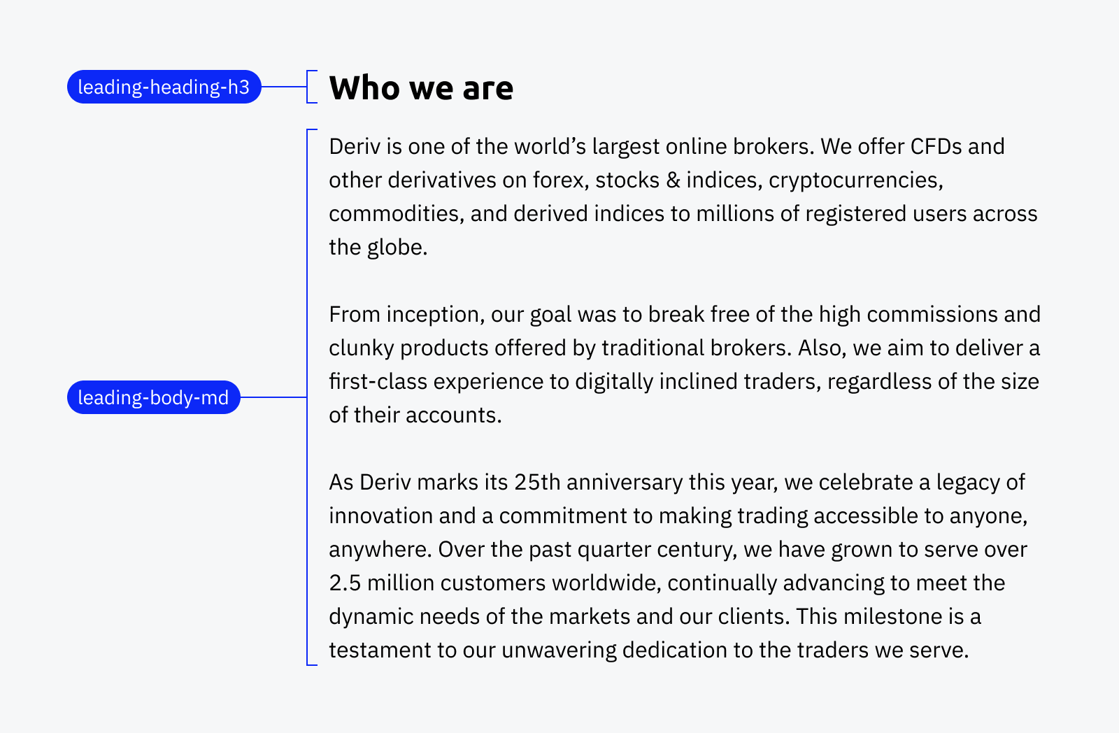
Quill tokens are the foundation of consistency, translating design decisions (e.g., in Figma) into standardised class names for developers. This ensures a unified look and feel across all Deriv products.
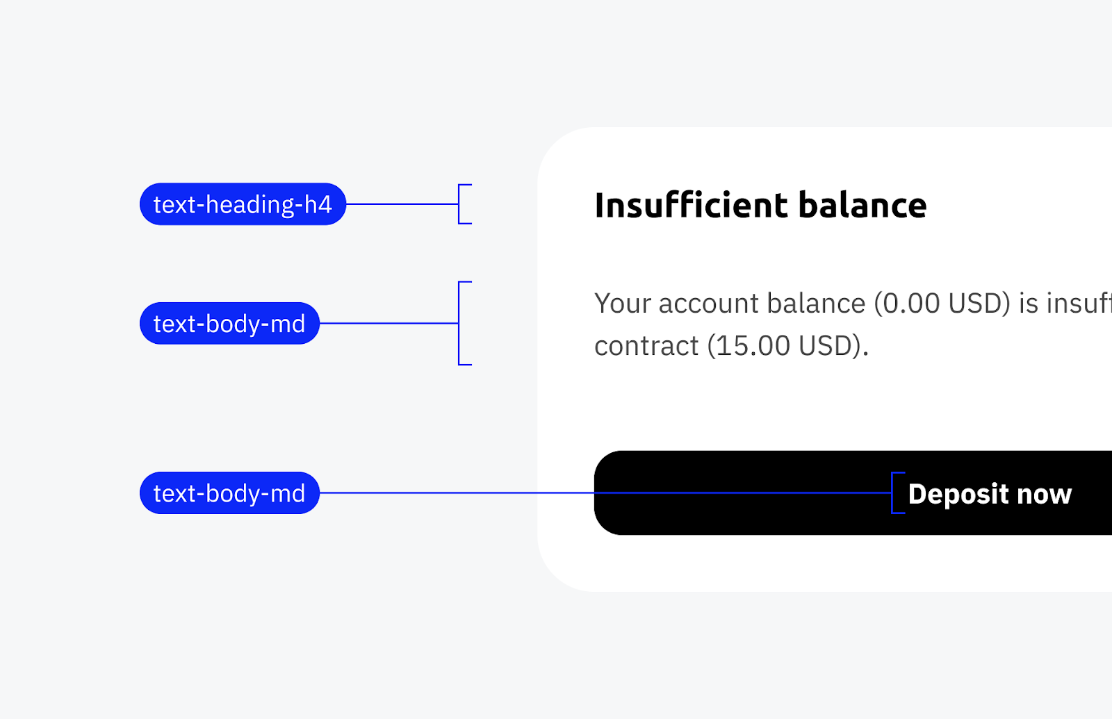
Let's take a closer look at the structure of Quill tokens, using gap, font-size, and line-height as examples. Each token type has a specific purpose and naming convention, with the postfix "-xx" indicating various sizes like xs (extra small), sm (small), md (medium), and lg (large).
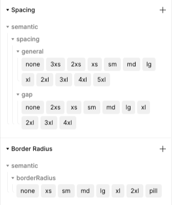
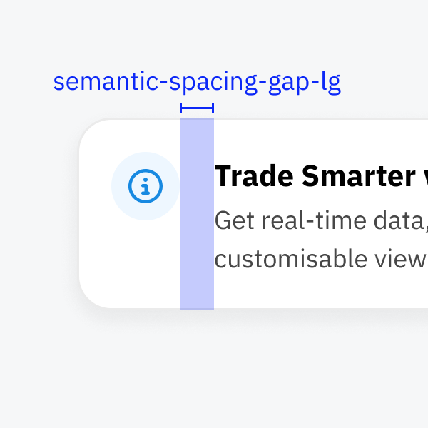
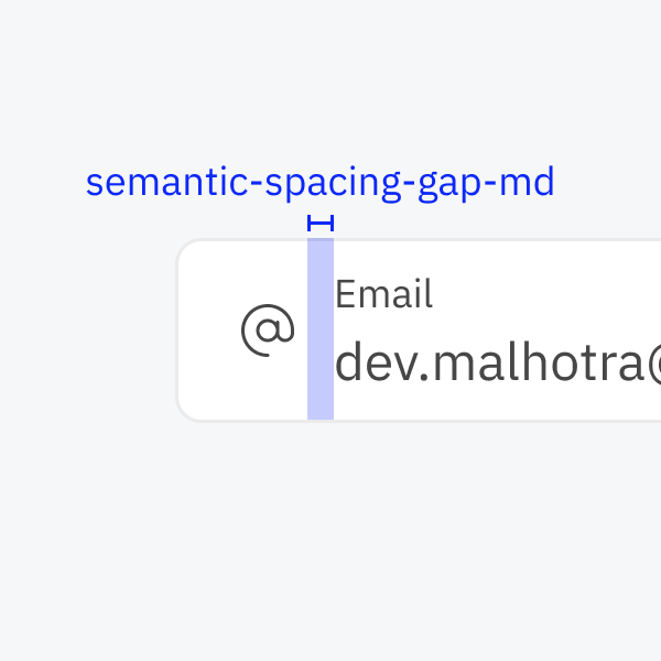
Gap
Defines spaces between elements for consistent layouts (semantic-spacing-gap-xx, e.g. semantic-spacing-gap-lg).
Font-size
Dictates typography sizes for different text elements, including headings (text-heading-xx), body text (text-body-xx), captions (text-caption), and monospaced font (text-code-xx).
Line-height
Sets the vertical spacing between lines of text, affecting readability and text density in headings (leading-heading-xx), body text (leading-body-xx), captions (leading-caption), and code blocks and snippets (leading-code-xx).
Quill tokens aren't just guidelines; they are the connective tissue aligning every pixel and code line with Deriv's design principles.
B. Quill UX design components: Core UI design elements
Quill components are the building blocks for consistent user interfaces. Reusable components, such as buttons and progress bars, provide designers and developers with essential elements for constructing user interfaces.
To streamline integration, all Quill components are available for export via NPM (node package manager).
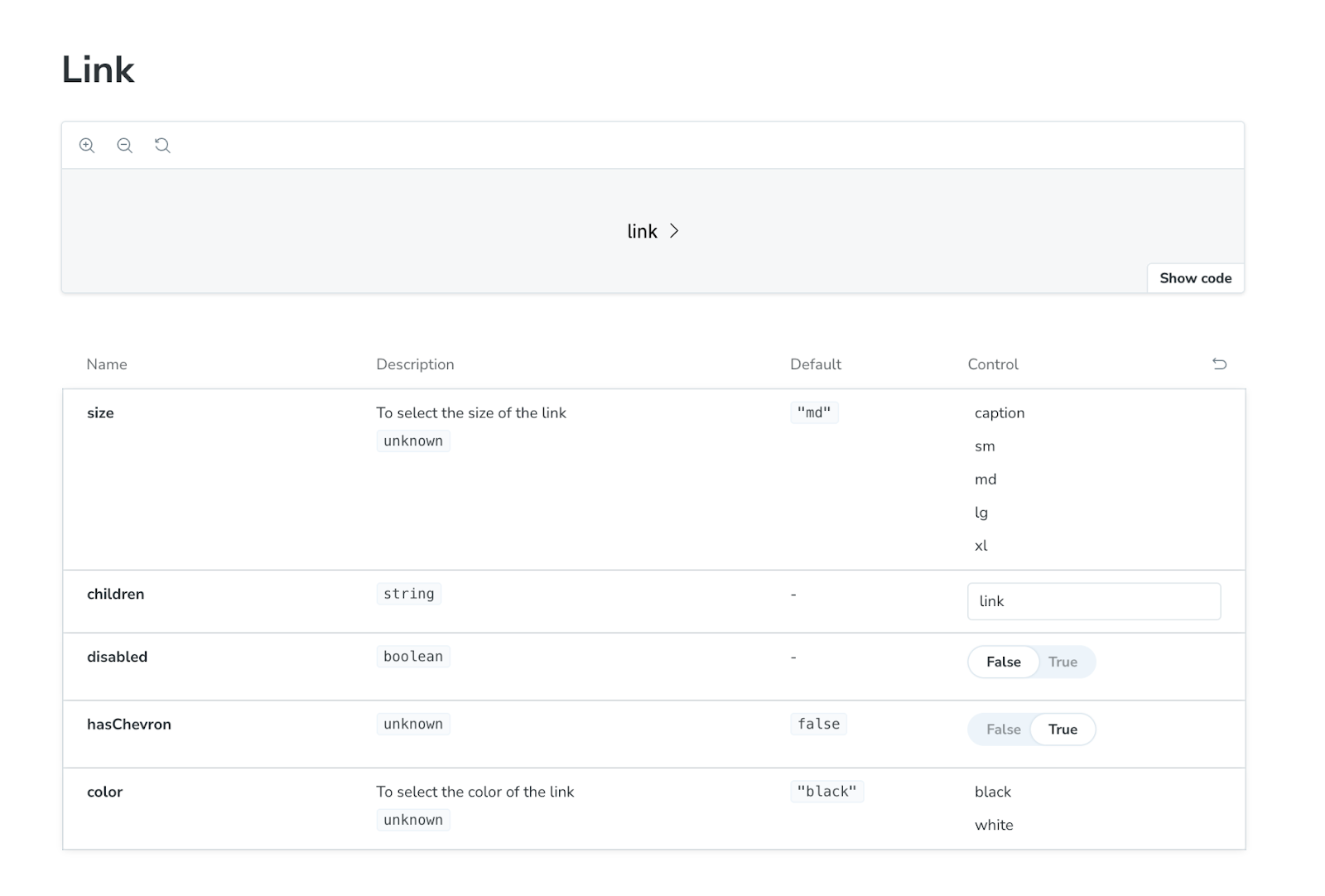
Let's illustrate this with a condensed example of a basic link component. (See the full code here.)
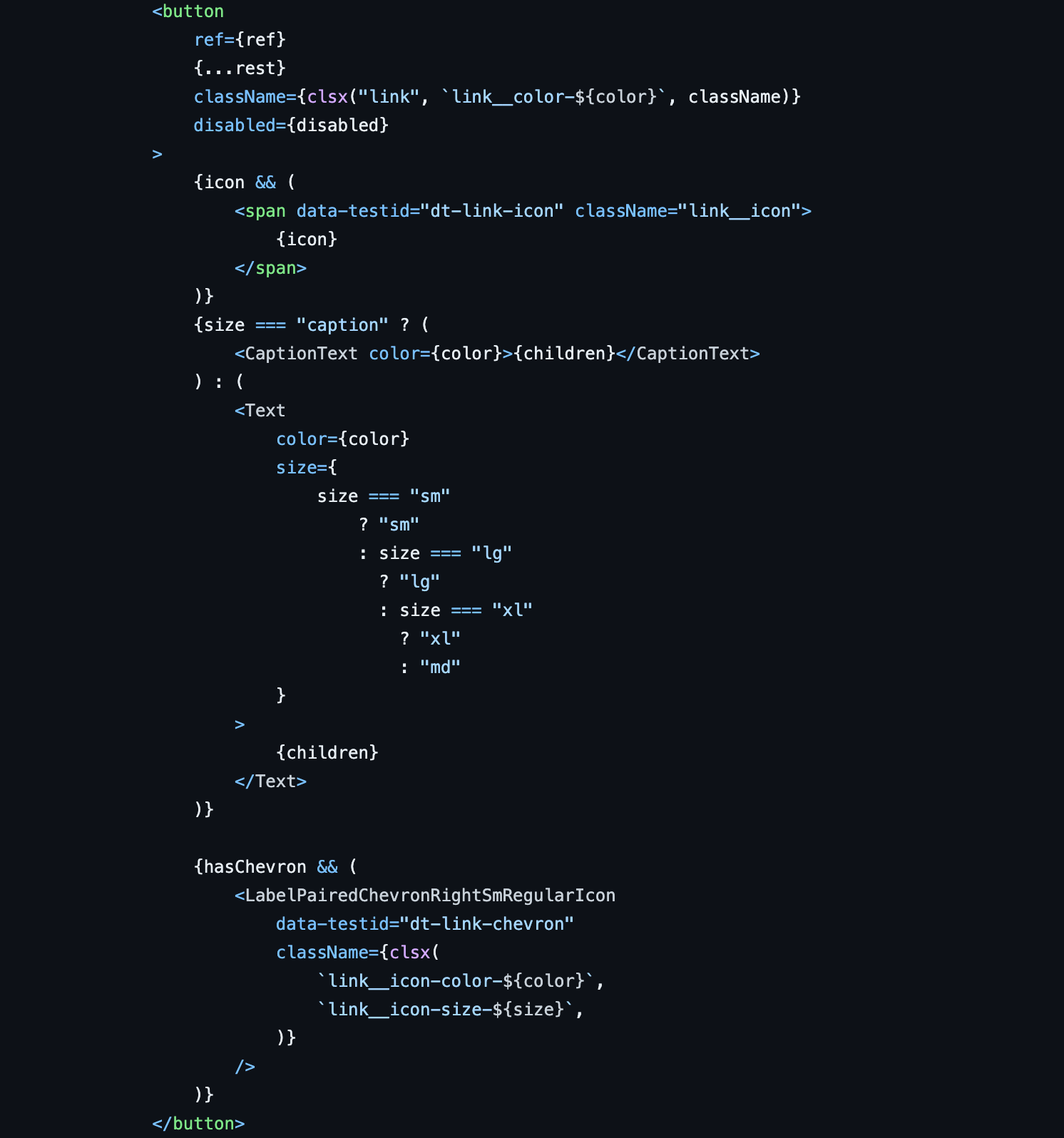
We can then use Storybook as an interactive playground to visualise our link component. You can explore our GitHub repository to see more examples.
Using Quill design components in the codebase
Let's take a closer look at how Quill components are used in our codebase. Consider the Notification component, designed for displaying popup-style notifications. Both the component and illustrative code examples are readily accessible in Storybook, simplifying its integration into any project.
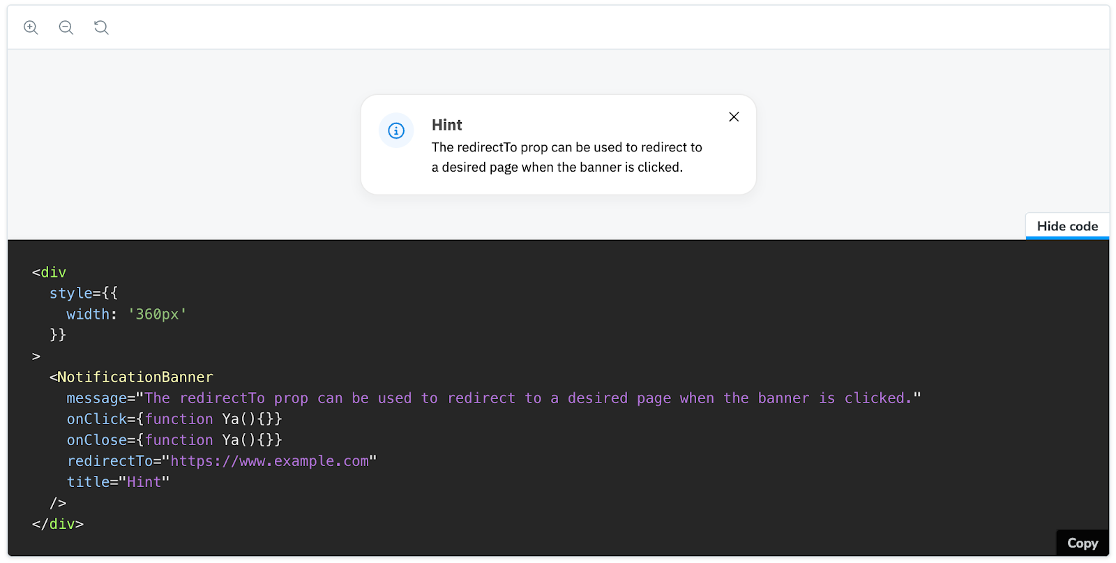
We also have multiple versions of some components available in Quill to allow for variations in required behaviours.
C. Quill icons: Vital UI design elements for visual consistency
We've developed a comprehensive set of SVG icons to meet the needs of all our projects. These icons are available in our Quill icons GitHub repository and can be integrated into our codebase using their unique identifiers.
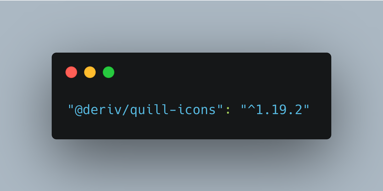
To incorporate Quill icons into any project, we first need to install the Deriv Quill icons package in our project.
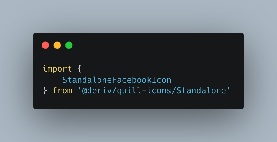
To use the icons, we can import the specific icons from the NPM package.
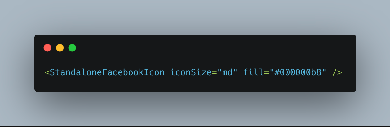
Inside the component, we can use the imported icon as a JSX element.
Due to the volume of icons in use, we created the “Quill Icon Park” application, a visual directory and search application that allows designers and developers to search the Quill icon library easily.
Accessing Quill icons
For those looking to dive into the world of Quill icons, here’s where you can find everything you need:
- Project repository: Our GitHub repository and NPM package.
- Quill Icon Park: Explore the GitHub Repo and website for an in-depth look at the icons, including visual previews and usage guidelines.
The evolution of Quill: Charting a course for the future of UX and UI design at Deriv
Quill is not a static system; it's constantly evolving to meet Deriv's changing needs. We're working on exciting integrations:
- CMS integration: This will empower content creators and developers to manage and deploy content within our CMS system while maintaining design consistency.
- Mobile app integration: We're also extending Quill to our mobile apps, optimising components for smaller screens and ensuring a seamless experience across all platforms.
Quill’s impact on interface design
Quill is more than just a design system; it's a shared language for our teams, ensuring that every pixel and code snippet contributes to an exceptional trading experience. As Quill continues to grow and adapt, it will play an increasingly vital role in shaping the future of design at Deriv.
About the author
Habib Al Islam Miah is a Lead Frontend Engineer at Deriv, passionate about technology, AI, and computer languages, building user-friendly applications and writing stories about A/B testing and frontend tech stacks. In his free time, he stays active with various sports, blending his love for tech and traveling.